
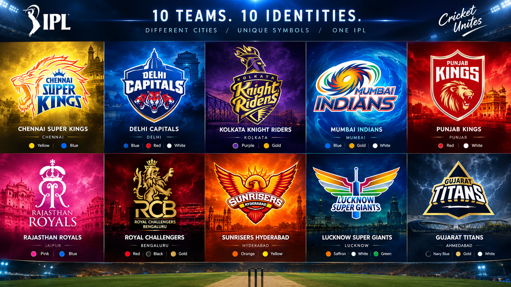
IPL team logos make each franchise recognisable long before a player walks onto the field. Across the ten teams described for the 2025 season, the identities use animals, crowns, shields, mythological references and city connections to convey qualities such as energy, courage, ambition and resilience. Colours play an equally important role, giving every shirt, flag and graphic a distinct visual character.
What makes an IPL logo memorable?
A successful cricket logo has to work in many settings: on a jersey, a stadium screen, a social-media post and a small score graphic. That is why the IPL’s franchise marks generally rely on a clear central symbol and a limited colour palette. Lions, birds, tigers and knights make immediate visual statements, while lettering ensures the franchise name remains central to the identity.
The meanings associated with logos should be read as visual interpretations rather than as measures of a team’s ability. A lion can suggest bravery or authority, for example, but it does not guarantee a result. Readers who also follow match-analysis material may come across free cricket betting tips, although a franchise emblem is best understood as a branding device rather than a guide to on-field outcomes.
The ten franchise identities
Chennai Super Kings: a crowned lion in yellow
Chennai Super Kings uses a roaring lion as the focal point of its logo. The lion represents strength and power, two qualities that suit the competitive nature of franchise cricket. Yellow is the dominant colour and is associated with energy and optimism, helping the identity stand apart visually from darker team palettes.
A crown appears above the team name in blue. It reinforces ideas of leadership and dominance, while also giving the mark a royal quality. The tagline associated with the franchise is “Whistle Podu,” meaning “Blow the Whistle.” Together, the lion, crown and bold yellow make the logo direct, uncomplicated and easy to recognise.
Delhi Capitals: shield, tigers and a city landmark
Delhi Capitals combines several features within a shield-shaped identity. Shields conventionally suggest protection and resolve, which makes the form a natural fit for a sporting team. Three roaring tigers form the central animal motif, representing unity and power in the interpretation attached to the design.
The logo also includes a dome resembling Delhi’s Parliament building, establishing a link to the franchise’s home city. Its blue, red and white scheme balances modern sporting intensity with a more traditional civic reference. Blue and red are presented as colours of trust and passion, while white provides contrast. The team’s tagline is “Dildaar Dilli.”
Kolkata Knight Riders: a warrior transformed into a torch
Kolkata Knight Riders uses a knight’s head above a shield, directly reflecting the team name. The knight is not simply a historical figure: it has also been shaped to resemble a torch. This gives the design a sense of movement and purpose, suggesting courage, strength and a willingness to compete.
Purple and gold give the logo its distinctive visual identity. The colours are associated with luxury and royalty, which suits the knightly imagery. The franchise’s Bengali tagline, “Korbo, Lorbo, Jeetbo Re,” translates as “We will act, fight, and win.” The logo therefore brings together a local-language message and a traditional warrior symbol in a contemporary form.
Mumbai Indians: a spinning chakra-inspired mark
Mumbai Indians stands apart from animal-based logos through its swirling chakra-inspired symbol. The Sudarshan Chakra is associated with Vishnu and is commonly understood as a symbol of strength and protection. In the logo, the rotating pattern also suggests continual energy, an appropriate idea for a fast-paced T20 side.
The shape can resemble a cyclone or turbine, adding further suggestions of speed and force. Blue and gold dominate the identity: gold conveys ambition, grandeur and royalty, while blue is linked to the sky and ocean. That connection also reflects Mumbai’s coastal setting. The franchise tagline is “Duniya Hila Denge Hum,” meaning “We will rock the world.”
Punjab Kings: a lion built around valour
Punjab Kings returns to the lion motif, placing a roaring lion’s head within an emblem-style design. Here, the animal is used to communicate aggression, authority and determination. As a symbol traditionally linked with kingship, the lion also fits naturally with the franchise name.
Red and white define the colour scheme. Red conveys passion and power, while white is linked with purity in the interpretation of the design. The result is a forceful, high-contrast identity that presents the side as fearless. “Sada Punjab,” meaning “Our Punjab,” is the tagline associated with the team, connecting the franchise name closely to its regional identity.
Rajasthan Royals: a pink monogram and crown
Rajasthan Royals takes a less literal approach than teams built around animals. Its logo centres on two reversed Rs in a stylised monogram. The handwritten treatment of those letters creates a distinctive form, while the franchise name below is set in a serif typeface that gives the design a more formal appearance.
A crown above the lettering signals leadership and royal ambition. Pink is particularly important because it refers to Jaipur’s “Pink City” identity, while also evoking the energy and royalty associated with Rajasthan. The team’s “Halla Bol” tagline means “Raise Your Voice.” In 2025, the franchise also launched a pink “Pinky Promise” jersey to highlight women-led change in the state.
Royal Challengers Bengaluru: an attacking lion
Royal Challengers Bengaluru uses another lion, but its stance gives the identity a more confrontational feel. The animal is shown with raised claws and an open mouth, visually communicating courage, pride and aggression. A crown complements the lion and reflects the aim of reaching the top of the competition.
Gold makes the lion prominent against the red background, while black conveys power and authority. White lettering helps the team name remain visible within the stronger colours. The well-known tagline, “Ee Sala Cup Namde,” means “This year the cup is ours.” The design relies on classic sporting imagery but uses contrast and posture to make the symbol feel energetic.
Sunrisers Hyderabad: eagle, sun and flames
Sunrisers Hyderabad has one of the most literal name-to-logo links in the league. An eagle spreads its wings across the emblem, symbolising dominance, strength and vision. Behind its head sits a rising sun, making the “Sunrisers” name visible through the imagery rather than through text alone.
Flames around the sun add intensity, while orange and yellow reinforce ideas of energy, hope and positivity. The design is unusually expansive because the eagle’s wings create a wide silhouette, unlike the enclosed shapes used by shield-based logos. “Rise Up to Every Challenge” is the franchise tagline, matching the bird’s upward and commanding pose.
Lucknow Super Giants: a Garuda-like bird and cricket symbols
Lucknow Super Giants uses a bird-like motif resembling Garuda, a figure associated with protection and strength. The wings include saffron, white and green, echoing the colours of the Indian flag. This choice gives the logo a national visual reference while retaining a distinctive shape for the franchise.
At the centre, a bat and ball make the sport explicit. That practical detail ensures the logo can be identified as a cricket emblem even when viewed independently of the team name. The identity is more minimal than several of the animal-and-shield designs, relying on the bird’s wings and a small cricketing motif to communicate its purpose. Its tagline is “Bhavhar Ka Team.”
Gujarat Titans: a kite-shaped symbol with lightning
Gujarat Titans uses a sharply shaped logo that resembles a kite, an object closely associated with Gujarati culture. The kite suggests flight and ambition, while a lightning bolt beneath the name adds a feeling of pace and power. The pointed structure has also been compared with a spaceship, fitting the “Titans” theme.
Dark blue, white and gold give the emblem a restrained but premium appearance. Unlike logos driven by a roaring animal face, Gujarat Titans relies on geometry and movement. Its tagline, “Sounds Like Thunder, Strikes Like Lightning, We Stop at Nothing,” develops the same weather-and-energy imagery found in the lightning detail.
Can logo changes be traced clearly?
A genuine logo evolution guide needs dated versions of each emblem and verified details of when each alteration was introduced. Without that sequence, it is not possible to state reliably which elements were changed, retained or replaced by a particular franchise. The 2025 designs, however, show that city references, animal symbols, royal imagery and bold colour palettes remained central to IPL branding.
The strongest IPL logos work because they communicate quickly. Whether it is Chennai’s crowned lion, Mumbai’s spinning chakra, Jaipur-linked pink, Hyderabad’s eagle or Gujarat’s kite form, each emblem gives supporters a visual shorthand for their team.